
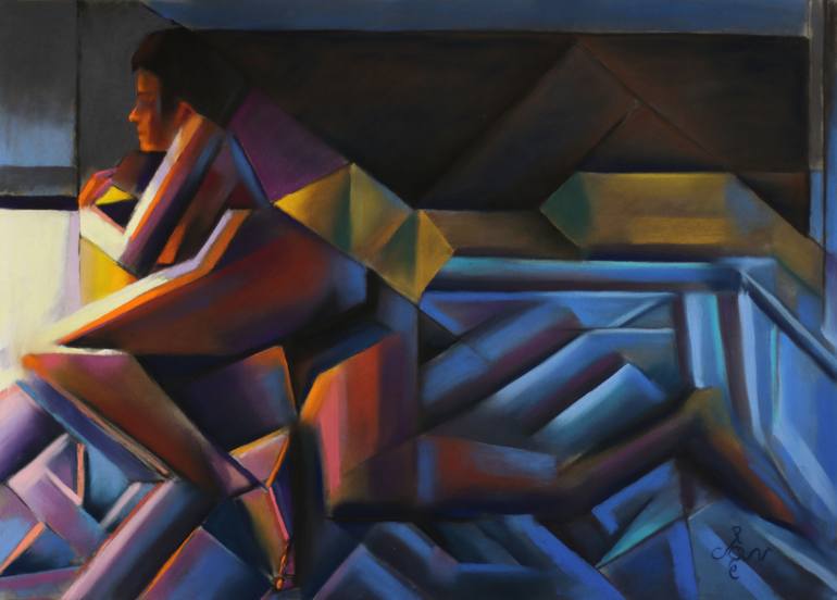
"Golden Night – 08-03-21" Drawing
Drawing, Pastel on Paper
27.3 W x 19.6 H in
Ships in a Box
This work will ship flat in a sturdy, well-protected cardboard box. Read More
$1,918
Shipping Included
14-day free returns
Trustpilot Score
ABOUT THE ARTWORK
DETAILS AND DIMENSIONS
SHIPPING AND RETURNS
All Things Round? This pastel drawing Golden Night – 08-02-21 is based on a previous graphite pencil drawing Roundism 10-08-20. What I do is to browse through my collection of drawing and just pick one to execute in color. For some reason people seem to like the concept of Roundism – 03-01-16 (sold)...
Year Created:
2021
Subject:
Styles:
Mediums:
Drawing, Pastel on Paper
Rarity:
One-of-a-kind Artwork
Size:
27.3 W x 19.6 H x 0.1 D in
Ready to Hang:
Not Applicable
Frame:
Not Framed
Authenticity:
Certificate is Included
Packaging:
Ships in a Box
Delivery Cost:
Shipping is included in price.
Delivery Time:
Typically 5-7 business days for domestic shipments, 10-14 business days for international shipments.
Returns:
Free returns within 14 days of delivery. Visit our help section for more information.
Handling:
Ships in a box. Artists are responsible for packaging and adhering to Saatchi Art’s packaging guidelines.
Ships From:
Netherlands.
Need more information?
Need more information?
Corné Akkers
Netherlands
1969, born in Nijmegen. My work can be seen in many countries all over the world. Corné employs a variety of styles that all have one thing in common: the ever search for the light on phenomena and all the shadows and light planes they block in. His favorites in doing so are oil paint, dry pastel and graphite pencil. He states that it’s not the form or the theme that counts but the way planes of certain tonal quality vary and block in the lights. Colours are relatively unimportant and can take on whatever scheme. It’s the tonal quality that is ever present in his work, creating the illusion of depth and mass on a flat 2d-plane. Corné combines figurative work with the search for abstraction because neither in extremo can provide the desired art statement the public expects from an artist. Besides all that, exaggeration and deviation is the standard and results in a typical use of a strong colour scheme and a hugh tonal bandwith, in order to create art that, when the canvas or paper would be torn into pieces, in essence still would be recognizable.
Artist Recognition

Featured in Saatchi Art's printed catalog, sent to thousands of art collectors

Artist featured by Saatchi Art in a collection
Why Saatchi Art?
Thousands of
5-Star Reviews
We deliver world-class customer service to all of our art buyers.
Global Selection of Original Art
Explore an unparalleled artwork selection from around the world.
Satisfaction Guaranteed
Our 14-day satisfaction guarantee allows you to buy with confidence.
Support Emerging Artists
We pay our artists more on every sale than other galleries.