


VIEW IN MY ROOM
Geesje Kwak (2021) Print
Netherlands
Select a Material
Fine Art Paper
Select a Size
8 x 10 in ($40)
Add a Frame
White ($80)
Artist Recognition
Featured in the Catalog
Artist featured in a collection
About The Artwork
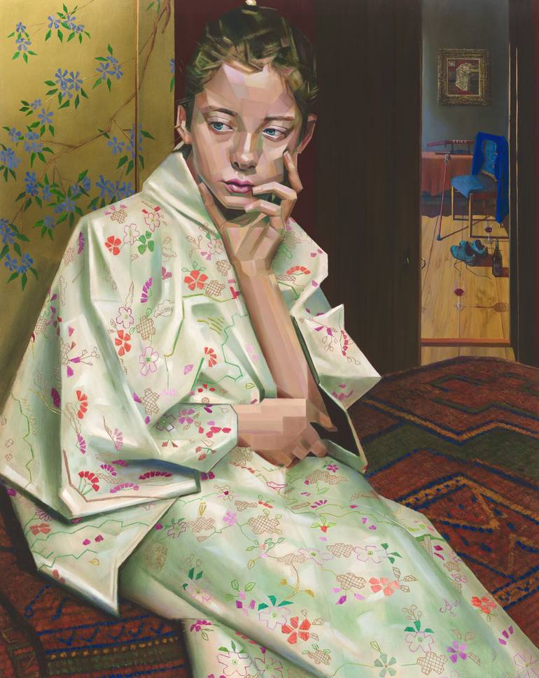
Abstracting in Oil After the success of my initial drawing I decided to dissect Geesje Kwak geometrically even further. Surely it is an ode to abstraction in Japanese art in the first place. After kicking off the painting I came to realize it had to serve another goal as well. That was to pass the abstract as realistic. Even though the painting oozes out realism it is more abstract that it lets on. Do you agree? Old Master Allure One thing led to another. The rigid plains reminded me to the stiff look of portraits made by the Flemish Primitives a bit. However, the latter smoothed out plains and painted then round. Nevertheless I wanted to obtain the allure of an old master even though I do not like that qualification much. It always sounds a bit quaint to me. I only relate to old masters because of my love for refined techniques and feel for subtle and lush textures. My contribution would be to put everything I like in the mix. So it came to be that aspects of cubism, impressionism, realism and even surrealism got married in this oil. A Fetish for Satin? When I take on a new project I am brimming over with ideas through the process of association soon enough. Obviously many of them are inspired by many artists before me like Gabriël Metsu. At the Mauritshuis in the exhibition ‘Dutch Masters from British Country Houses’ I saw a couple of his paintings. I must admit I am a little bit jealous of his satin treatment. I happen to have a series of interference paints by Williamsburg. Not that I have employed them often, certainly now was the time to do so. Time for some serious bling-bling and do my part in satin depictions. Enter Vermeer Talking about inspirational sources the carpet also pays tribute to Johannes Vermeer’s depiction of tapestry, such as in ‘A Girl Asleep’. When I studied different carpets I noticed there are hairy ones and ones that look square knotted. A perfect reason to exaggerate the knots a bit in order to connect with the slight cubistic styling. Consequently the carpet resembles one from the Teyler Museum more than Vermeer’s carpet. I was there because of the Constable exhibition. I kept tapestry rugged in order to have it contrast with the fine kimono embroidery. The unsaturated brown English and Venetian reds contrast the more saturated colors in the robe. By the way the room in the back was modeled after Vermeer’s aforementioned art work. One of my favorites. To Embroider an Oil The suggestion of stitched blossom patterns came late in the game. One evening I saw a video of an exhibition of all of Breitner’s Kimono girls at Museum Twenthe. M presumtion of a kimono appearance was all wrong! Perhaps modern kimono motifs are painted but in Breitner’s days they would have been expensive by the elaborate embroidery. That was a set back for me because I wanted to get it absolutely right. I had to experiment with thickening paints in order to suggest stitched threads. They represent an abstraction in itself, creating the illusion of a single petal when stacked in threads. So even though the painting looks realistic there is abstraction in large and small objects. Maybe a single thread is a single Planck length in this work even though combined they gifted the kimono its opulent look. Enter the Craft On the toilet reading an article about Jeff Koons I realized I cannot relate to contemporary art much. I am a craftsman and like techniques, maybe even a modern pre-raphaelite. However, I also like the idea incorporated in the work of art. Why not putting the stress on combining them both in modern art once again like modernists did? Another thing that bothers me is it seems on social media like Instagram it is all about bling bling nowadays. Let’s bring back that one to art once again. Not the kitsch type but artistically well-balanced. I hope people will appreciate the effort put into a true work of art. Perhaps duck tape and bananas will wear away soon enough. Oil painting on wood panel (96.8 x 77 x 0.9 cm) Artist: Corné Akkers
Details & Dimensions
Print:Giclee on Fine Art Paper
Size:8 W x 10 H x 0.1 D in
Size with Frame:13.25 W x 15.25 H x 1.2 D in
Frame:White
Ready to Hang:Yes
Packaging:Ships in a Box
Shipping & Returns
Delivery Time:Typically 5-7 business days for domestic shipments, 10-14 business days for international shipments.
Handling:Ships in a box. Art prints are packaged and shipped by our printing partner.
Ships From:Printing facility in California.
Have additional questions?
Please visit our help section or contact us.
Netherlands
1969, born in Nijmegen. My work can be seen in many countries all over the world. Corné employs a variety of styles that all have one thing in common: the ever search for the light on phenomena and all the shadows and light planes they block in. His favorites in doing so are oil paint, dry pastel and graphite pencil. He states that it’s not the form or the theme that counts but the way planes of certain tonal quality vary and block in the lights. Colours are relatively unimportant and can take on whatever scheme. It’s the tonal quality that is ever present in his work, creating the illusion of depth and mass on a flat 2d-plane. Corné combines figurative work with the search for abstraction because neither in extremo can provide the desired art statement the public expects from an artist. Besides all that, exaggeration and deviation is the standard and results in a typical use of a strong colour scheme and a hugh tonal bandwith, in order to create art that, when the canvas or paper would be torn into pieces, in essence still would be recognizable.
Artist Recognition
Featured in Saatchi Art's printed catalog, sent to thousands of art collectors
Artist featured by Saatchi Art in a collection
Thousands Of Five-Star Reviews
We deliver world-class customer service to all of our art buyers.
Global Selection
Explore an unparalleled artwork selection by artists from around the world.
Satisfaction Guaranteed
Our 14-day satisfaction guarantee allows you to buy with confidence.
Support An Artist With Every Purchase
We pay our artists more on every sale than other galleries.
Need More Help?