


VIEW IN MY ROOM
Risque – 17-02-22 Print
Netherlands
Select a Material
Fine Art Paper
Select a Size
9 x 12 in ($40)
Add a Frame
White ($80)
Artist Recognition
Featured in the Catalog
Artist featured in a collection
About The Artwork
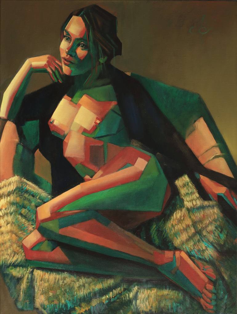
Nice Thick Patches A new Risque oil painting in the Series by same name. After my last one I wanted to wander in a straight linear landscape again. Variation is the spice of life. Besides that, I bought myself some fine straight brushes I can lay squarish strokes with. The motif for this one was based on my colored pencil drawing ‘Risque – 01-22’. That was expressionistic and without a cubist styling because the resolution of the batches strokes simply didn’t allow it. It would have been too much of a good thing. I noticed the hatching technique I developed throughout the years is more suitable for realistic depictions. Not in this oil though. Here I could lay nice thick and straight patches. Color Palette In Roundism – 04-02-22 I used a new color palette consisting of Pozzuoli Earth, Pompean Earth, Yellow Brown, Nickel Titatium, Sevres Green, Perilene Black and Ultramarine. Something different from previous color schemes but I liked it that much that I do once more. Perhaps there will be a whole series with this new palette. What Lies Beneath Sometimes there are reasons one only can fathom consciously in retrospective. My model Julia is dutch but Ukranian of origin and obviously she worries about the faith of her fatherland nowadays. Will the Russian invade it or will diplomacy solve the issue according to the principles of brinkmanship? As a trained artist I am used to convert what my senses tell me into stains of paint. Colors are relations I tell my students often. This complementary color scheme red-green seems fit to express her supposed double feelings towards the resulting situation. In my eyes such color schemes seem to express agression but also passion, alertness and vividness. Dervishes Dancing But look again: I made these reds and greens entwining eachother like dervishes dancing. Saturated and unsaturated variations are complementing eachother much more subtlely, almost resembling and approaching eachother. I like this play of apparent contrasts. Perhaps The Russian and Ukranian one day can see they complement eachother as well. Nothing contradictory unless there is agreement at the same time. My array of reds and greens in all sorts of tones and hues might inspire presidents Zelenskyy and Putin to see their relationship should express Khalil Gibran’s view. Better to quote than to paraphrase him: “And stand together yet not too near together: For the pillars of the temple stand apart, And the oak tree and the cypress grow not in each other's shadow.” Oil on linen (60 x 80 cm) Artist: Corné Akkers
Details & Dimensions
Print:Giclee on Fine Art Paper
Size:9 W x 12 H x 0.1 D in
Size with Frame:14.25 W x 17.25 H x 1.2 D in
Frame:White
Ready to Hang:Yes
Packaging:Ships in a Box
Shipping & Returns
Delivery Time:Typically 5-7 business days for domestic shipments, 10-14 business days for international shipments.
Handling:Ships in a box. Art prints are packaged and shipped by our printing partner.
Ships From:Printing facility in California.
Have additional questions?
Please visit our help section or contact us.
Netherlands
1969, born in Nijmegen. My work can be seen in many countries all over the world. Corné employs a variety of styles that all have one thing in common: the ever search for the light on phenomena and all the shadows and light planes they block in. His favorites in doing so are oil paint, dry pastel and graphite pencil. He states that it’s not the form or the theme that counts but the way planes of certain tonal quality vary and block in the lights. Colours are relatively unimportant and can take on whatever scheme. It’s the tonal quality that is ever present in his work, creating the illusion of depth and mass on a flat 2d-plane. Corné combines figurative work with the search for abstraction because neither in extremo can provide the desired art statement the public expects from an artist. Besides all that, exaggeration and deviation is the standard and results in a typical use of a strong colour scheme and a hugh tonal bandwith, in order to create art that, when the canvas or paper would be torn into pieces, in essence still would be recognizable.
Artist Recognition
Featured in Saatchi Art's printed catalog, sent to thousands of art collectors
Artist featured by Saatchi Art in a collection
Thousands Of Five-Star Reviews
We deliver world-class customer service to all of our art buyers.
Global Selection
Explore an unparalleled artwork selection by artists from around the world.
Satisfaction Guaranteed
Our 14-day satisfaction guarantee allows you to buy with confidence.
Support An Artist With Every Purchase
We pay our artists more on every sale than other galleries.
Need More Help?